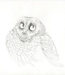
Marker Tutorial - Barred Owl
Hello!!! Due to popular demand from many of my friends, classmates, and coworkers, I have finally put together a technique tutorial on how I color with markers. I do want to point out, however, that 99% of my work is trial and error and is rarely ever planned out. Though I try to plan out values and color, I still like to be spontaneous. Sometimes things don't come out the way I'd like and I have to start over, but I can always learn from that experience. In the end, it helps me figure out what works and what I need to do differently next time.
1) So let's start with the very first step: Knowing what you want to illustrate. This could be a character, an environment, a prop, or even a combination of the three. What are you going to be portraying and how do you want to portray it? I like to work from reference. Reference is the foundation for everything I do, and because I draw a lot of animals (mostly birds) I need all the reference I can get so design is believeable and accurate to what I'm portraying.
I used "Owls," by Floyd Scholz for this image. It is, by far, the best owl reference book out there.
2) It's time to draw! This part is fairly quick and sets up the blueprint for the rest of your illustration. Some of my instructors were very kean on thumbnails and rough sketches before the finalized sketch. I always start with a rough sketch or a couple rough sketches and pick the one I like most for the inking. I like to draw right on the paper I'm using for the final if my illustration since my marker works are always small in size.
Sketch materials: Tuscan Red Col-Erase pencil.
and then I go right inking! This is one of my favorite steps. It's almost theraputic for me because it's a slow and precise process. 95%of what I do traditionally is drawn in ink. Sometimes I skip the sketching process and draw with ink and color what I've drawn. For this illustration, I chose to draw it out first just so my the form and feather placement was better planned out.
Inking materials: .3pt and 1pt Copic Multiliner
3) It's time for color! Layering is key with markers. Much like watercolors, maker color isn't very opaque and needs to be layered. I like to use Copics, which layer beautifully and are very vibrant in color. It's also very easy to muddy up the colors too, so planning out your color palette is the best way to avoid any unwanted mistakes. Sometimes, I like to test out my colors on a piece of scrap paper to see how well they layer on top of one another. I also sometimes use a blank index card and color in swatches of each color I think I may want to use and make note of the marker numbers I used. this is extremely helpful for future illustrations of the same or similar character.
I set down the base tones with warm grey and skin colors
I add more warm grey.
I then move to medium tones with browns and more skin colors
I keep layering my colors
I end with the dark tones.
5) Don't forget the highlights! My all time favorite part of any illustration is putting in the highlights. Since the marker tones have already darkened up the illustration, you will need to apply an opaque high light color to achieve proper lighthing. Lighting has never been my strong suit so I find it kind of tricky. I'm also slightly lazy about it, so I like to use White-out because it dries quickly and is the most opaque liquid out there. The only downfall of white-out, is it clumps easy so you have to be very careful when applying it to the drawing. You may also use gesso or a white acrylic to apply your highlights. Keep in mind, however, that a lot of acrylic has to be layered. Sometimes I prefer the acrylic to the white-out because I have more control of what I'm applying and I'm layering to build up the consistency that I need. Acrylic also allows me to pick the type of light temperature I want for my highlights (cool or dark). I like using titanium white (or I add cyan to the white acrylic) if it's a cooler light and a warmer white/cream (I might add golden or ochre yellow to the white acrylic). Lastly, soft lead color pencils or pastels are great for highlights, and I would recommend using fixative after you're done coloring if you choose to use dry media. It's all up to you in the end.
I apologize for my grammar. It's time for bed.
Hope this is useful to you all! I am so thankful you stop by and visit my blog. All of your support means the world to me.
<3


No comments:
Post a Comment